Joanna Ambrosio
Hi there! The projects here highlight some of the work I’ve done and the impact I’ve made—though my full experience goes beyond what’s on display.<- More about me
Hootsuite
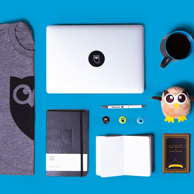
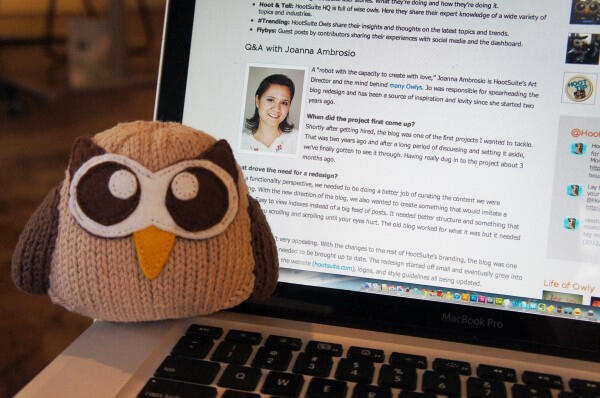
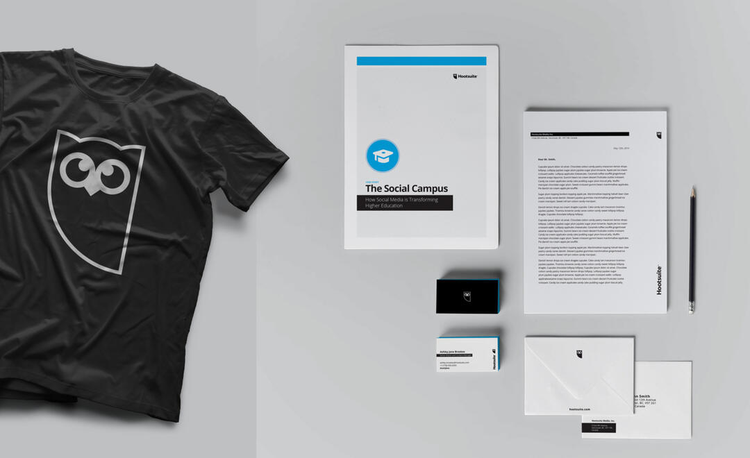
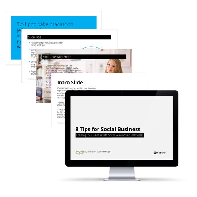
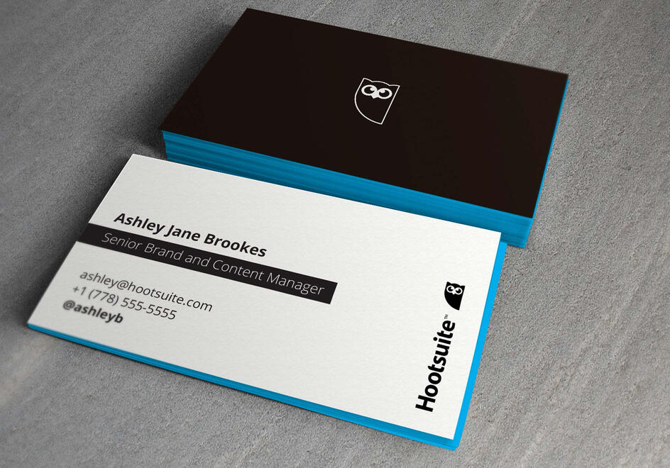
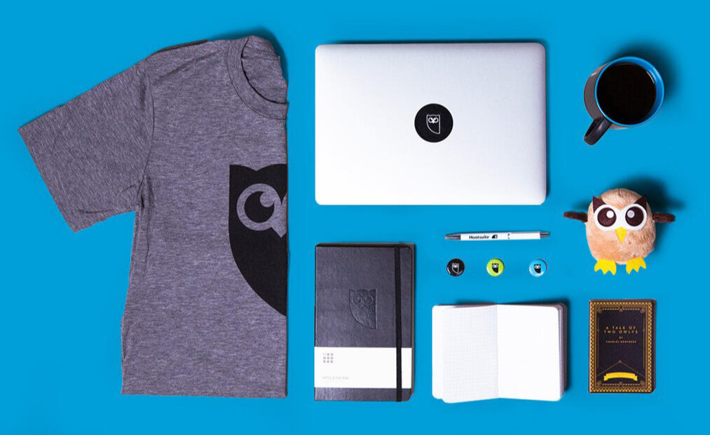
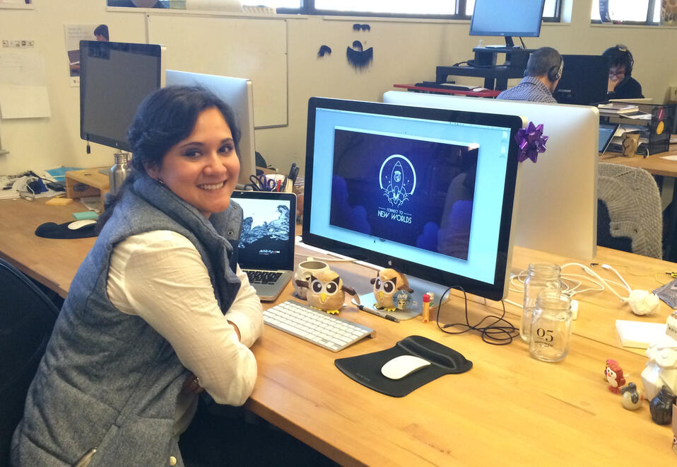
I was hired as employee #18 at the first Hootsuite Railtown office back in 2010. Back then, we didn’t call it an “office”; we referred to it as the “bunker” because it was basically below ground. I had a second-hand desk and a chair that would frequently go missing due to high demand. The internet was sketchy, and the power would sometimes go down. It was the best place to be introduced to the startup world.In my role, I was responsible for a wide range of tasks including creating web ad banners, UI design, developing marketing assets, and enhancing the beloved Owly mascot. I often stayed late to assist the Development team during product launches, worked closely with the Customer Support team to identify areas for improvement in brand awareness, and collaborated with the Sales team to create assets that supported their success.And then we grew! The company experienced hypergrowth and continued to expand its staff. I built a team of 7 designers for the marketing department and led them as an Art Director. Together, we helped the company achieve incredible milestones through our strong visual brand.One of the most significant projects for me was the Hootsuite re-brand. I collaborated closely with the Director of Marketing and Brand Manager to brainstorm, create, and implement our inaugural re-brand campaign. We hired a fantastic agency to assist us in enhancing our visual brand and voice, and I was involved in the project from beginning to end.Hootsuite’s original logo was created in Photoshop for web use only, featuring multiple colors, gradients, and elements that didn't translate well across different applications. We faced challenges when matching pantone swatches, creating favicons, and scaling it.The result was a new logo: a clean, abstract version of the owl (Owly) with a modern font for the wordmark. We got rid of all the Pantone swatches and kept it timeless in black and white. We could now highlight accents with vibrant colors for the visual aids, which helped us create different marketing assets that looked cohesive as part of a solid visual brand.The biggest challenge for the design team was to update all the existing assets with the new brand and get them ready for the launch. We teamed up with the international offices to gather all the necessary materials and explained the uses for each of them as brand advocates. To ensure success, we created style guides, held informational sessions, recorded them, and shared the recordings across teams. The re-brand was a success.
Jane App
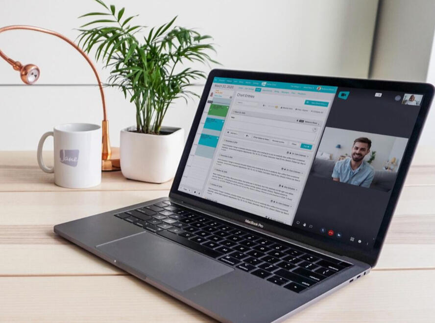
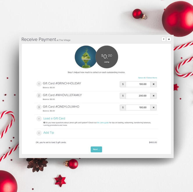
During my time at Jane, I had the opportunity to serve as a senior graphic designer, where I sharpened my skills in visual storytelling, brand development, and design strategy. As part of Jane's first marketing team, I played a key role in creating compelling visual assets that helped elevate the company's brand presence and resonated with its audience.From designing marketing materials to directing photoshoots and videos, I contributed to continuing to tell Jane's story, preserving its essence while enhancing brand recognition.It was a rewarding experience to be part of Jane's marketing and content teams, where I learned how prioritizing excellent customer service can in fact make a meaningful impact in a company's growth.
Café Cielo de Oro
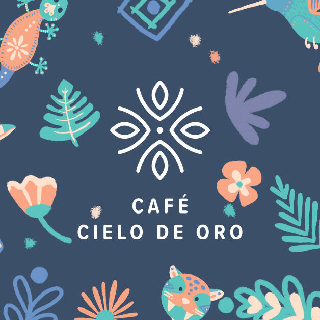
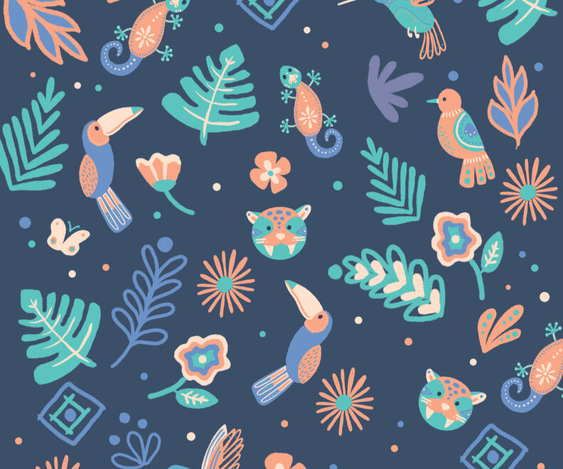
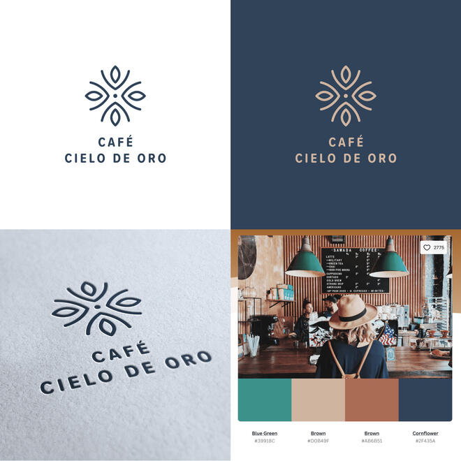
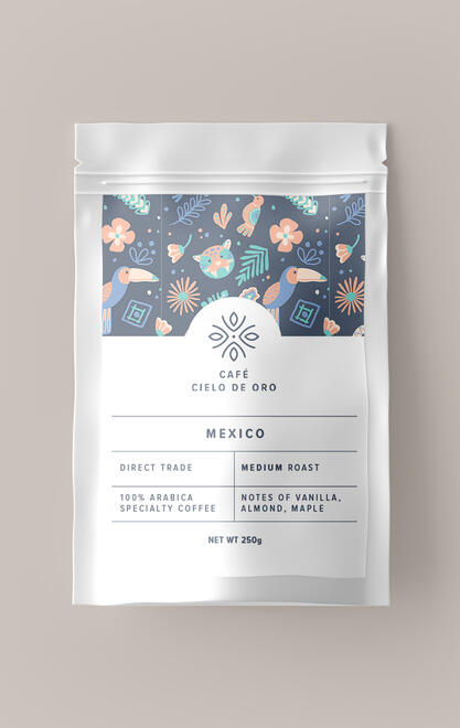
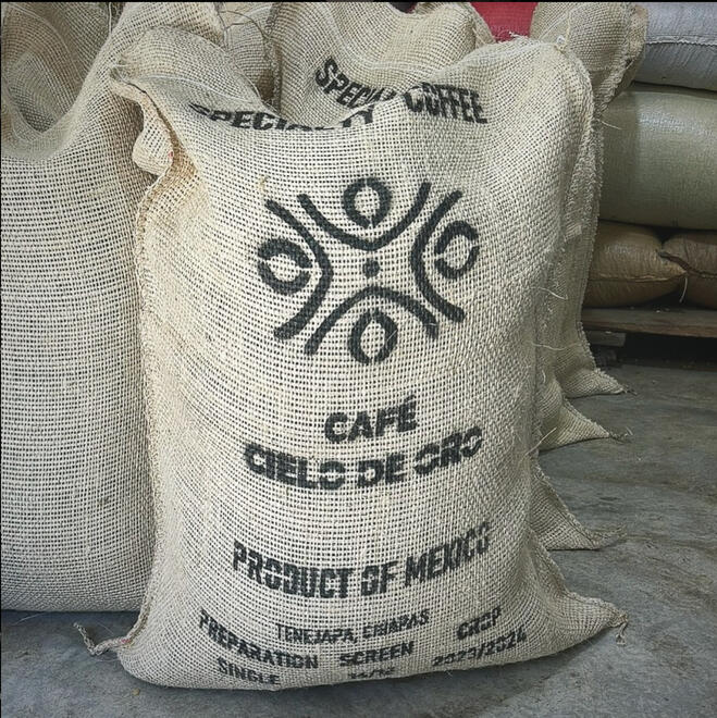
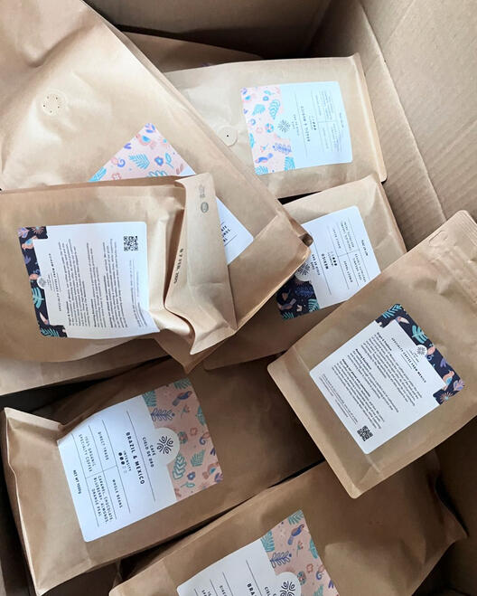
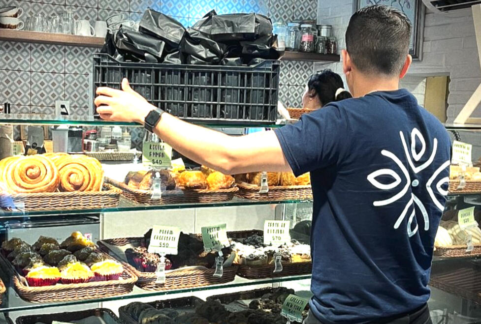
Café Cielo de Oro is a passionate coffee importer/exporter dedicated to supporting the community and promoting ethical practices within the coffee industry. Committed to sourcing high-quality, sustainably grown beans, Café Cielo de Oro works directly with small-scale coffee farmers, ensuring fair compensation and empowering local communities. They trive to make a positive impact on the lives of those involved in the production of their coffee.Working on this brand project was extremely fulfilling. It marries both my passions: design and mexican art. The use of a deep, rich color palette further enhances the premium feel of the brand, and the clean, sans-serif font adds a touch of timeless elegance. With a mix of Mexico-inspired motifs, this brand embraces its rich culture and warmth.
WeLAB Entertainment
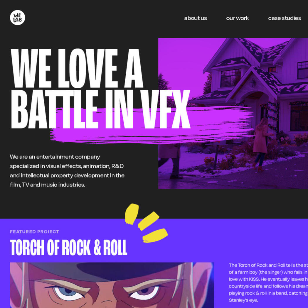
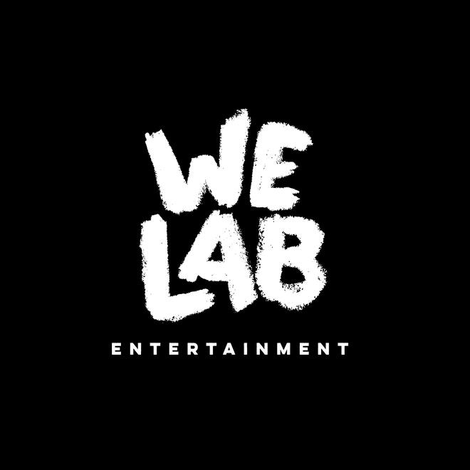
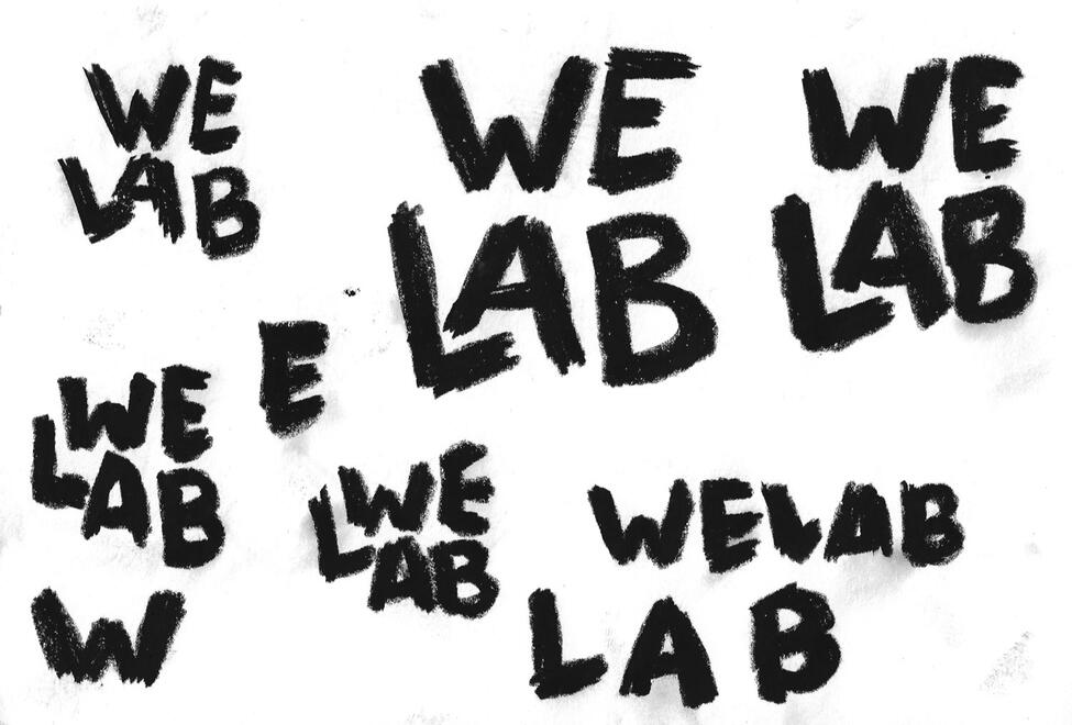
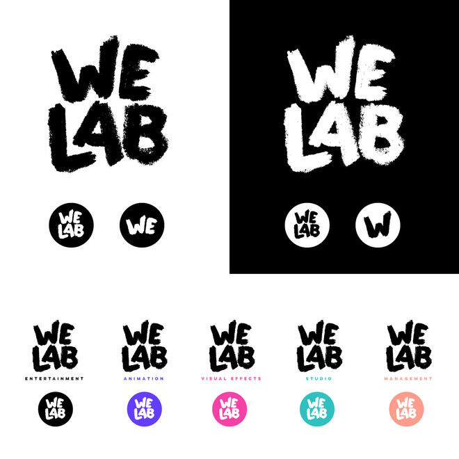
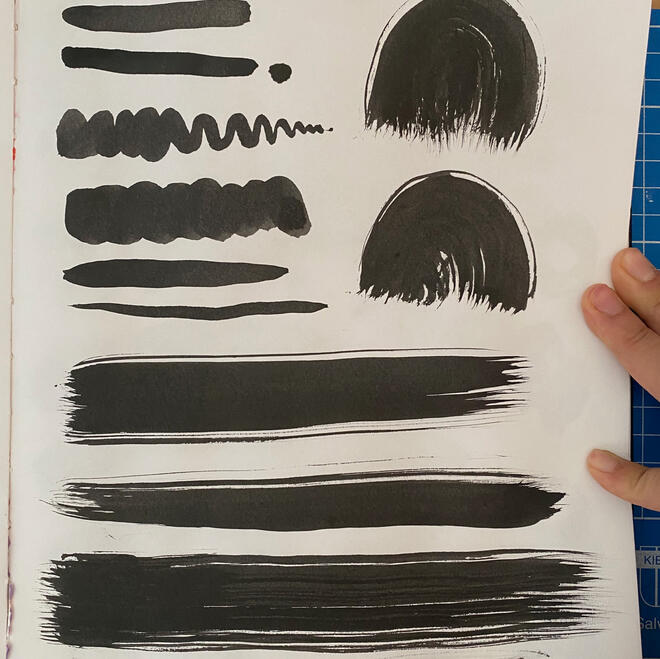
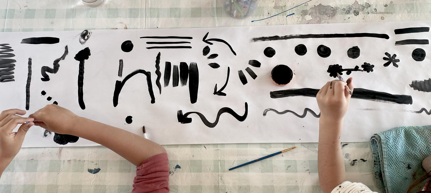
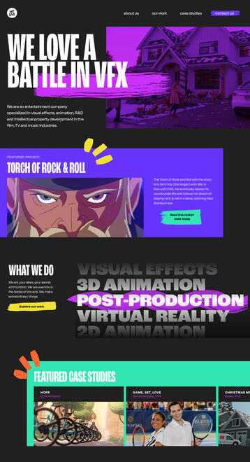
We Love a Battle Entertainment is the next chapter of Gamomo Creative Lab. My husband and partner, Kenji, and I have decided to solidify the next chapter for Gamomo with a new name, vision, and mission. Gamomo’s legacy is now WeLAB, We Love a Battle, which has always been our motto.We Love A Battle (WeLAB) is an entertainment company specializing in visual effects, animation, R&D, and intellectual property development in the film, TV, and music industries. We are animators, illustrators, visual effects artists, renderists, researchers, and producers. We are a laboratory of innovation and a world of possibilities.Our clients include Netflix, NBC, Hallmark, Lifetime, EOne Entertainment, MGA Entertainment, Vice Media, Last Gang Records, Much Fact, Canadian Media Funds, Telefilm, and many other amazing people and talent. We have proudly won a Communication & Arts Award for Best Marketing Campaign, the Minnesta WebFest Best VFX Award for Narco Leap, Animation Studio Festival Best Music Video Award, and a Leo Awards Nomination for Torch of Rock and Roll. Additionally, our work has been selected for the Panama Animation Festival, Montreal International Animation Festival, and Spark Animation Festival.Making art is a battle in itself: we fight to be heard, to get support, and to gain confidence. We fight for what we believe in. We fight with ourselves – to be better, to be vulnerable, to make the world a better place, to amaze. We wanted to reflect this struggle within our brand: imperfect brush strokes, bold colors, big text. We involved our kids in the process to keep it playful, which was a lovely way to define our style.
Poppy
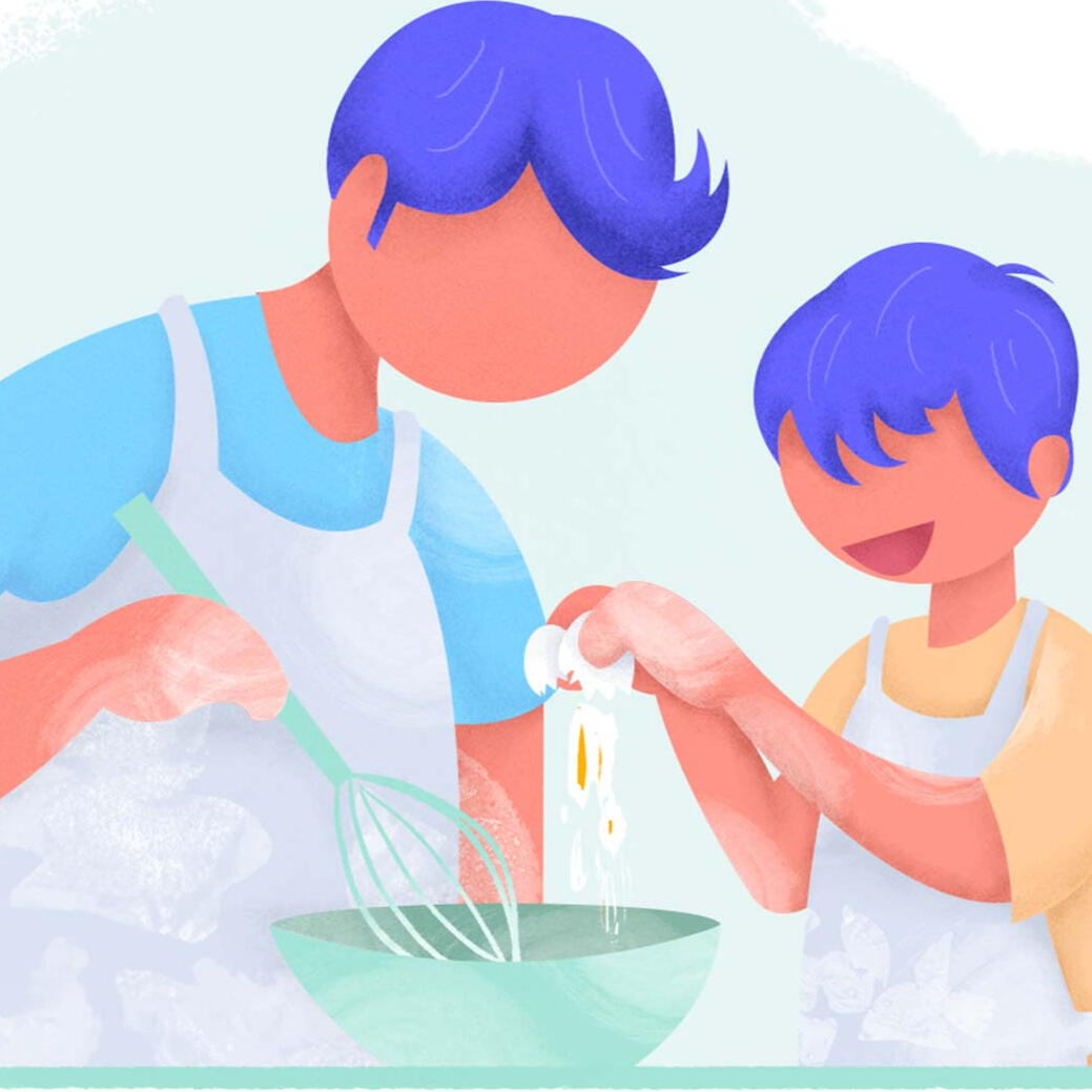
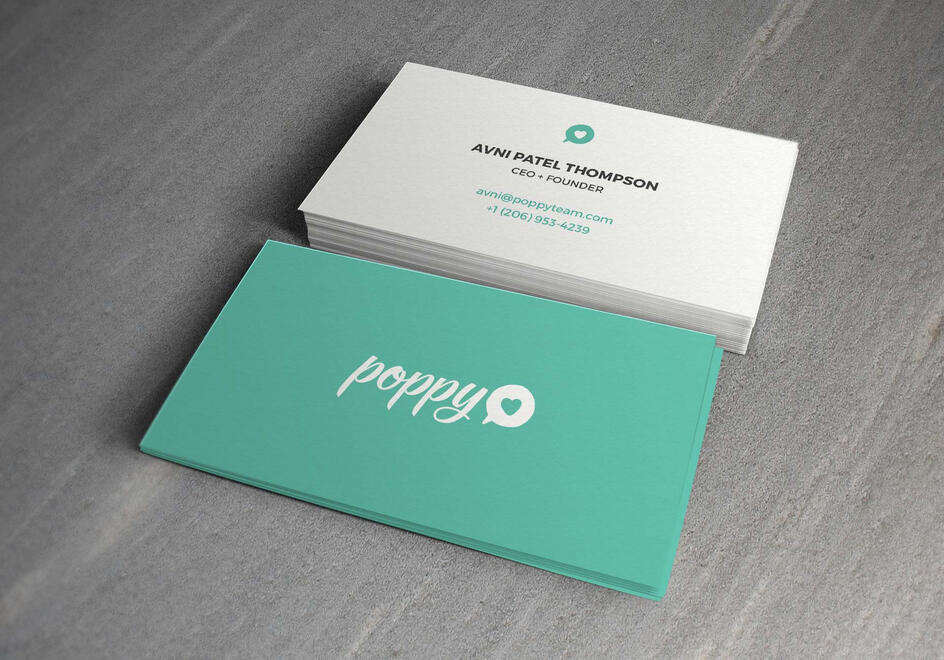
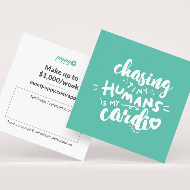
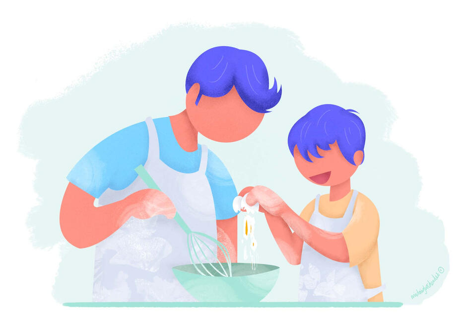
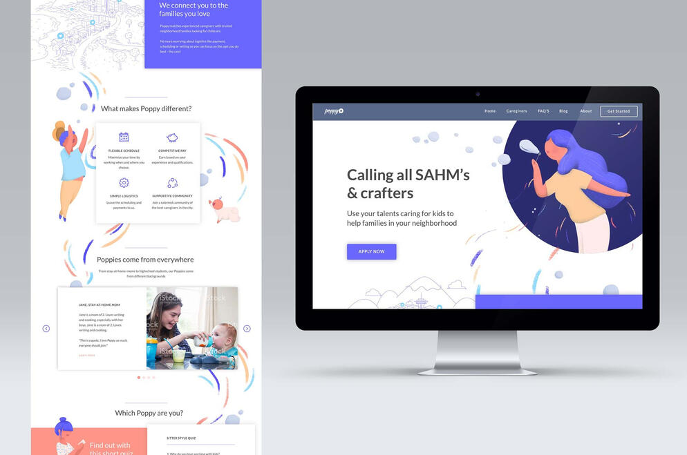
When I met Poppy's co-founder, Avni Patel-Thompson, I was immediately drawn to the project. Poppy's mission was to create a modern village that emphasized the community aspect of childcare. It recognized the challenges that families and new parents face and partnered with high-quality babysitters to provide support and care for families.As a new parent myself, I felt a strong connection to the market that Poppy was targeting.I was responsible for creating the entire visual brand for Poppy, including the logo, brand guidelines, icons, UI style guides, print and online materials, templates, slidedecks, and promotional materials. The visual style aimed to reflect Poppy's whimsical, fun, and engaging mission.When creating illustrations, my main focus was to convey a sense of trust. As a parent myself, I wanted to capture the emotions involved in leaving children in someone else's care. I aimed to create scenes that exuded comfort, playfulness, and safety, aligning with Poppy's core values.Additionally, I collaborated with the team to develop personalized assets, including hand-lettered elements, to resonate with caregivers and parents. I also contributed to the development of a new website with a clean, spacious look and vibrant colors and graphics.The results were well-received by the Poppy community and team.Long live Poppy <3
Gamomo Creative Lab
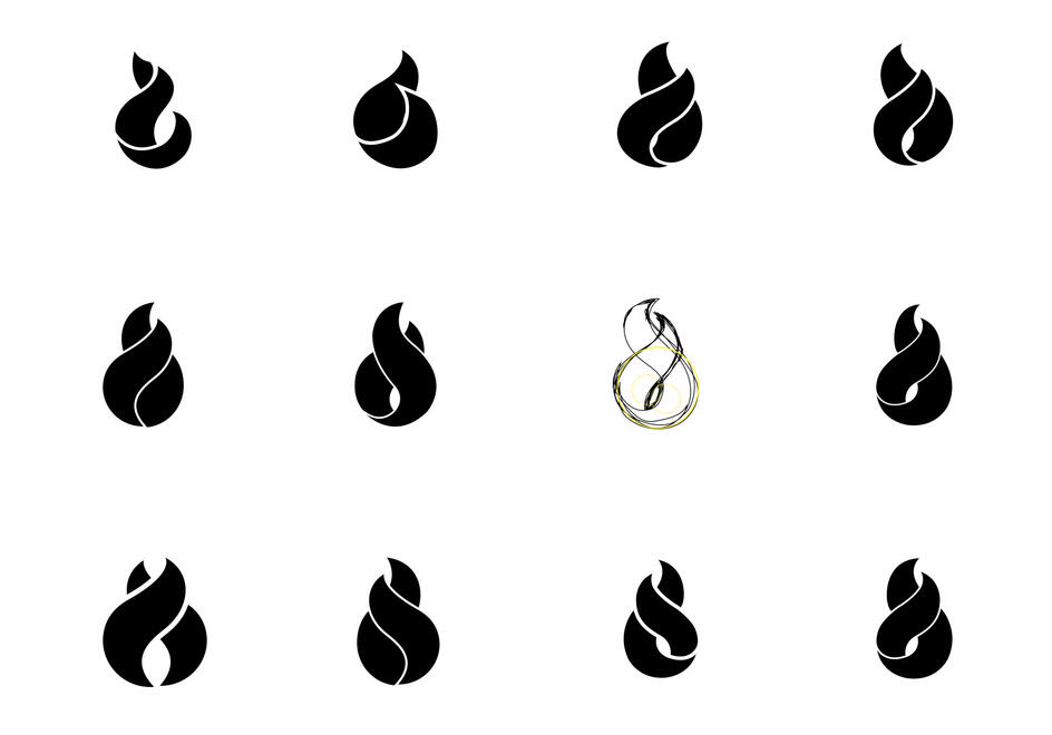
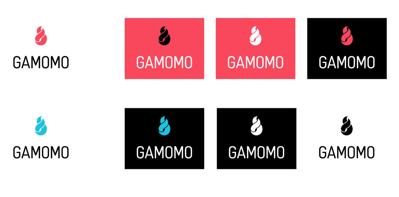
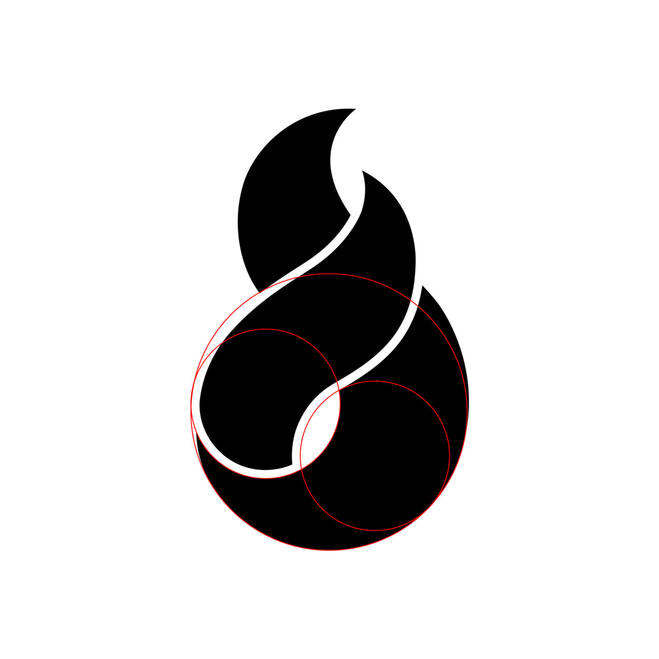
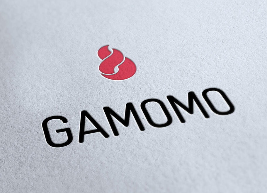
I co-founded Gámomo Creative Lab in 2007. We were recent grads making a name for ourselves in the back of a hair salon, with a minimal set-up at first. Exploring names for our design studio, we came across the Guam warrior name "Gámomo," which means "he who loves a battle." This was us. We love a good challenge (the battle) and helping companies succeed.ChallengeWithin seven years, we evolved from a graphic design studio to a motion/animation and VFX lab. Our work wasn't static anymore; it had movement, it was alive. We found the need to reflect this change in our brand and display art in motion in a static way.For our brand refresh, I explored different ways this flame could be transformed to mimic movement while keeping it clean, simple and geometrically aligned.ResultWe really liked the results, so we matched the icon with a soft-edged wordmark to complete our new face. This symbol embodies our essence and the fire we light within.
Bluebird Bone Broths
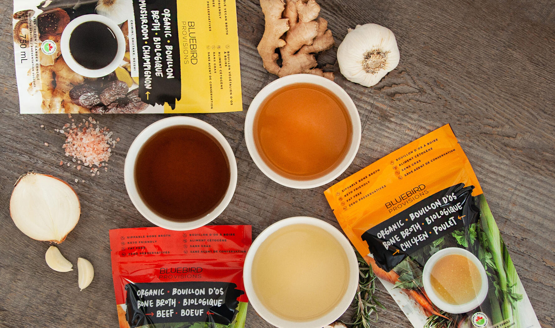
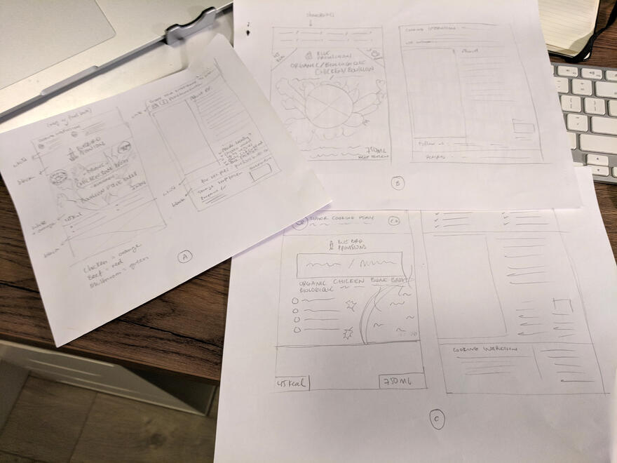
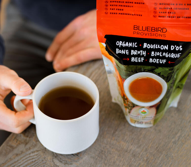
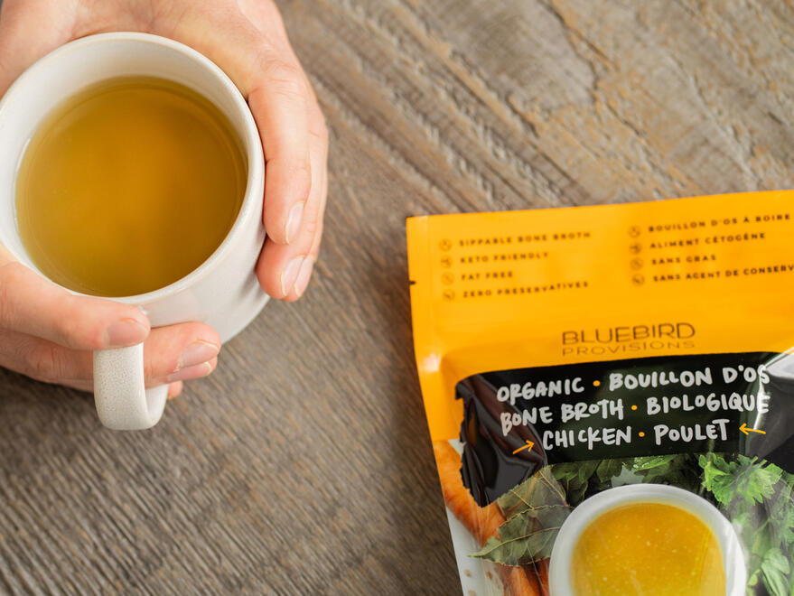
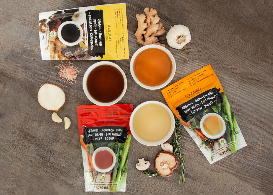
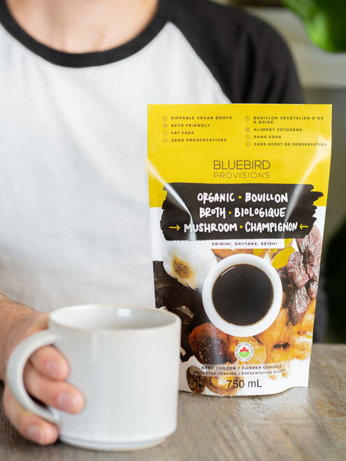
My first food packaging project was quite a learning experience. Food labels are no joke; everything from translated ingredients to approved font sizes has to be carefully monitored and regulated.One of the highlights for me was creating the label font by hand and art directing the photoshoot of the broth. Working with talented photographers to convey Bluebird's vision, I paid attention to every detail, from proper lighting to food brightness.Seeing these broth bags in the store while grocery shopping always made me smile.
